![Orchidea logo white with orange dot.png]](https://knowledge.orchidea.dev/hs-fs/hubfs/Orchidea%20logo%20white%20with%20orange%20dot.png?width=161&height=51&name=Orchidea%20logo%20white%20with%20orange%20dot.png)
You can analyze the activity in the channel with four different channel-specific charts. You can access and review charts in the following manner:
- Click on
.png?width=27&height=28&name=ratas%20(asetukset).png) in the top right corner of the channel to access charts.
in the top right corner of the channel to access charts. - From the appearing menu, open the chart you want to review by clicking on it.
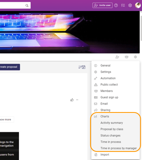
-
Once you have chosen the appropriate chart, you can define the filters for the chart:
- Range: filter the data by time range counting backward from today
- Frequency: summarize the data to day, week, month, or year level
💡If there's no data available, change the range and frequency.
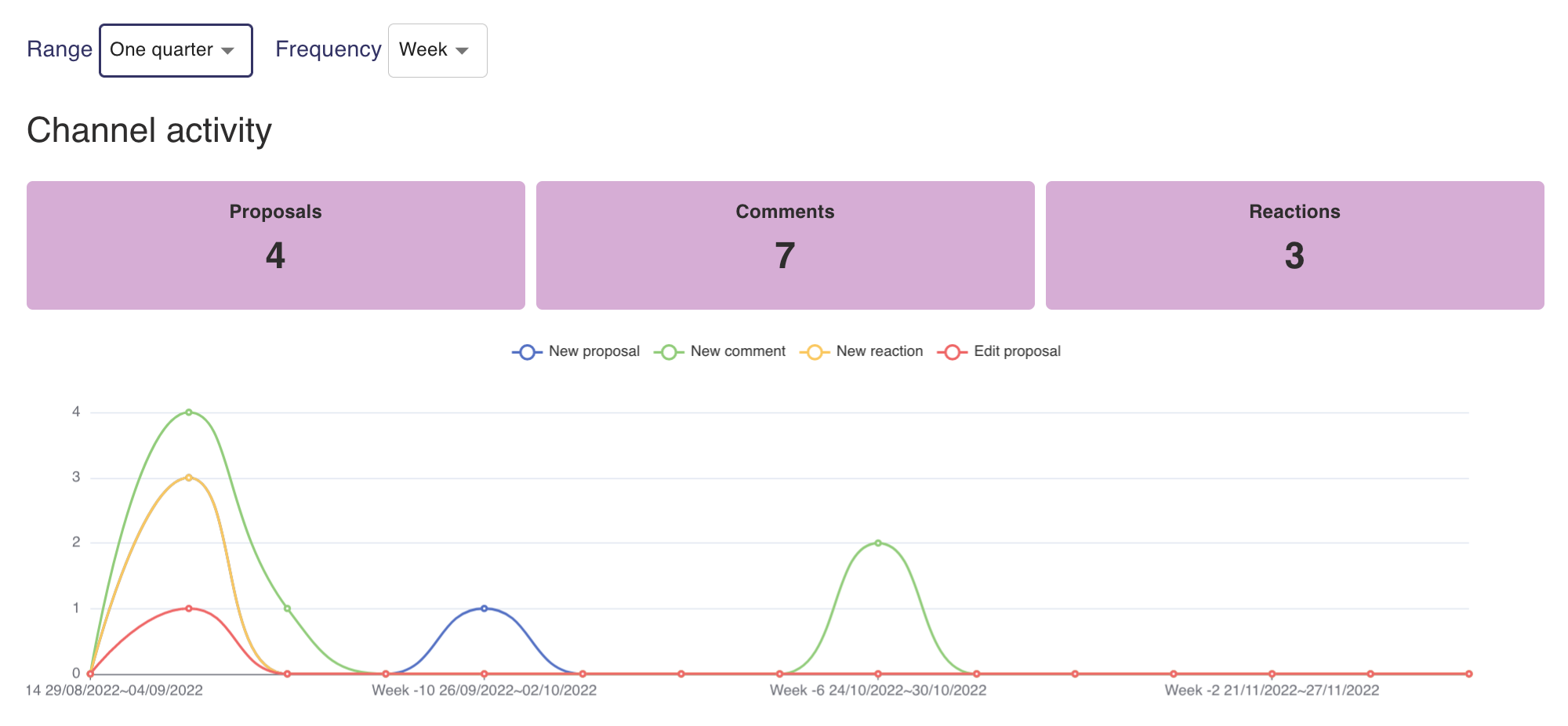
Activity summary
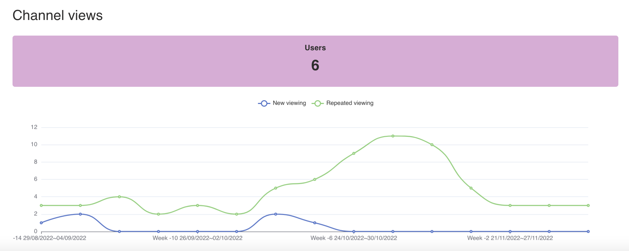
In Activity summary charts, you can review two things: Channel activity and Channel views.
Channel activity shows you the number of new proposals, comments and reactions.
Channel views tells the number of new channel users and number of returning viewers.
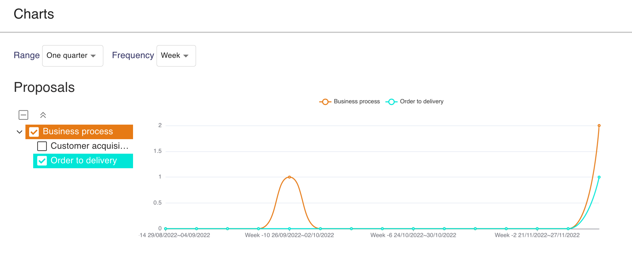
Proposal by class
From Proposal by class chart you can review classifications made on the proposals in certain time range. You can see which subcategories have the most proposals.
💡Please notice that if a proposal has been classified with the management form after the proposal submission, the classification is shown on the report on the date of the filling of the management form.
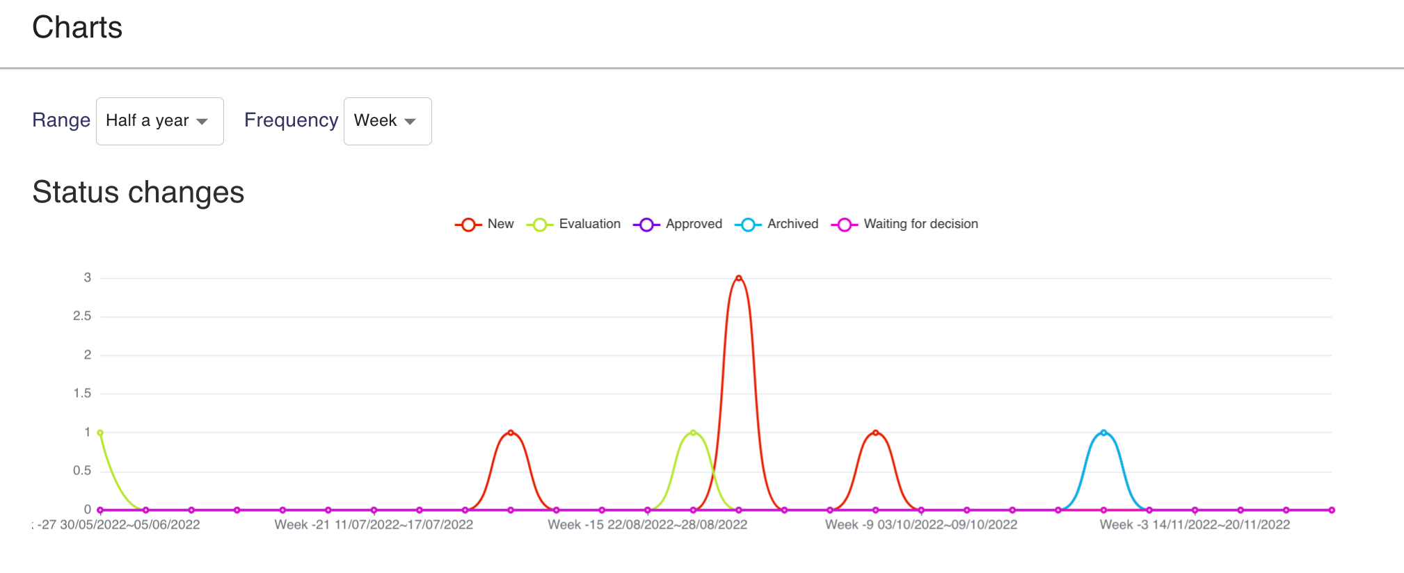
Status Changes
In Status changes charts, you can see how many proposals have been moved into that status during the chosen time frame.
Example: If one proposal has been moved to Evaluation status during that week, then the chart shows one spike on the Evaluation line.
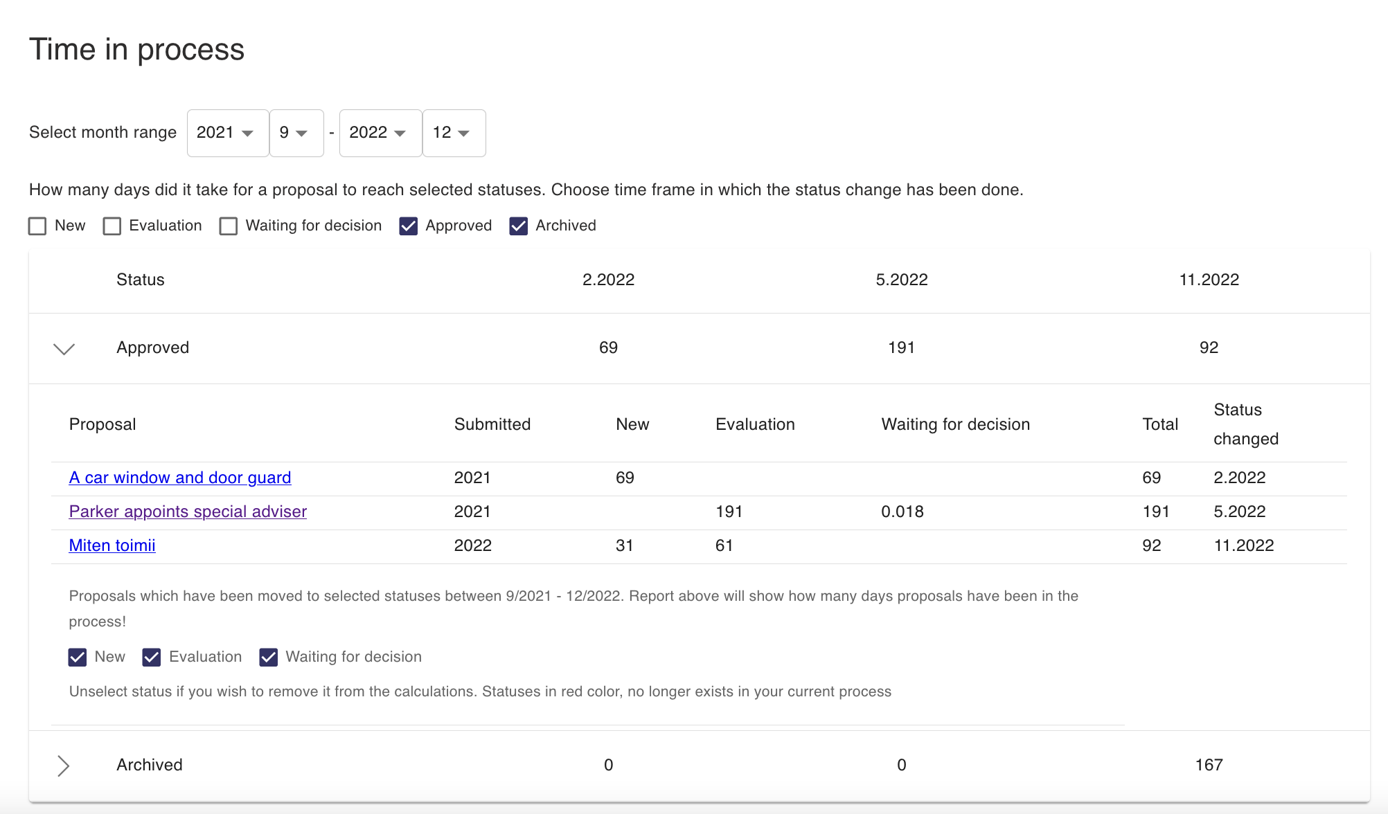
Time in process
From Time in process charts, you can review how long has the management process of a proposal taken. For example, you can see how many days it takes from the day of proposal submission to complete the management process, i.e.to move the proposal to either Archived or Approved status. You can change which status you are reviewing by ticking the box next to that status.
The month range function shows you all the months in which status changes have been made and the average number of days it took to reach that status from the first status.
Example: On 5.2022, so May 2022, it took an average of 191 days for the proposal to reach Approved status. So the proposal management process on the average took 191 days. On 11.2022, November 2022, the average amount of days it took to reach Archived status was 167 days.
Time in process by manager
Time in process by manager works as the time in process chart. You can see how long the management process of a proposal has taken by manager. You can review the length of the process though each proposal status.