
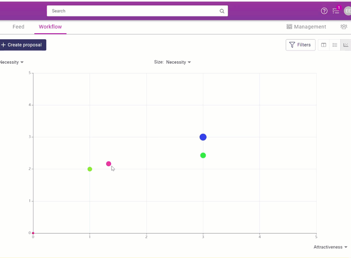
The bubble chart presents the proposals using the X and Y axes
1. Locations of bubble charts
You can visually view the evaluation of proposals by selecting the bubble chart:
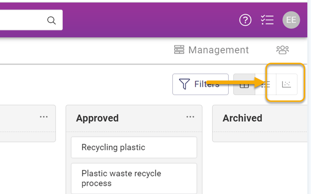
Channel-> Workflow-> Chart icon in the top right corner
Bubble chart in a challenge:
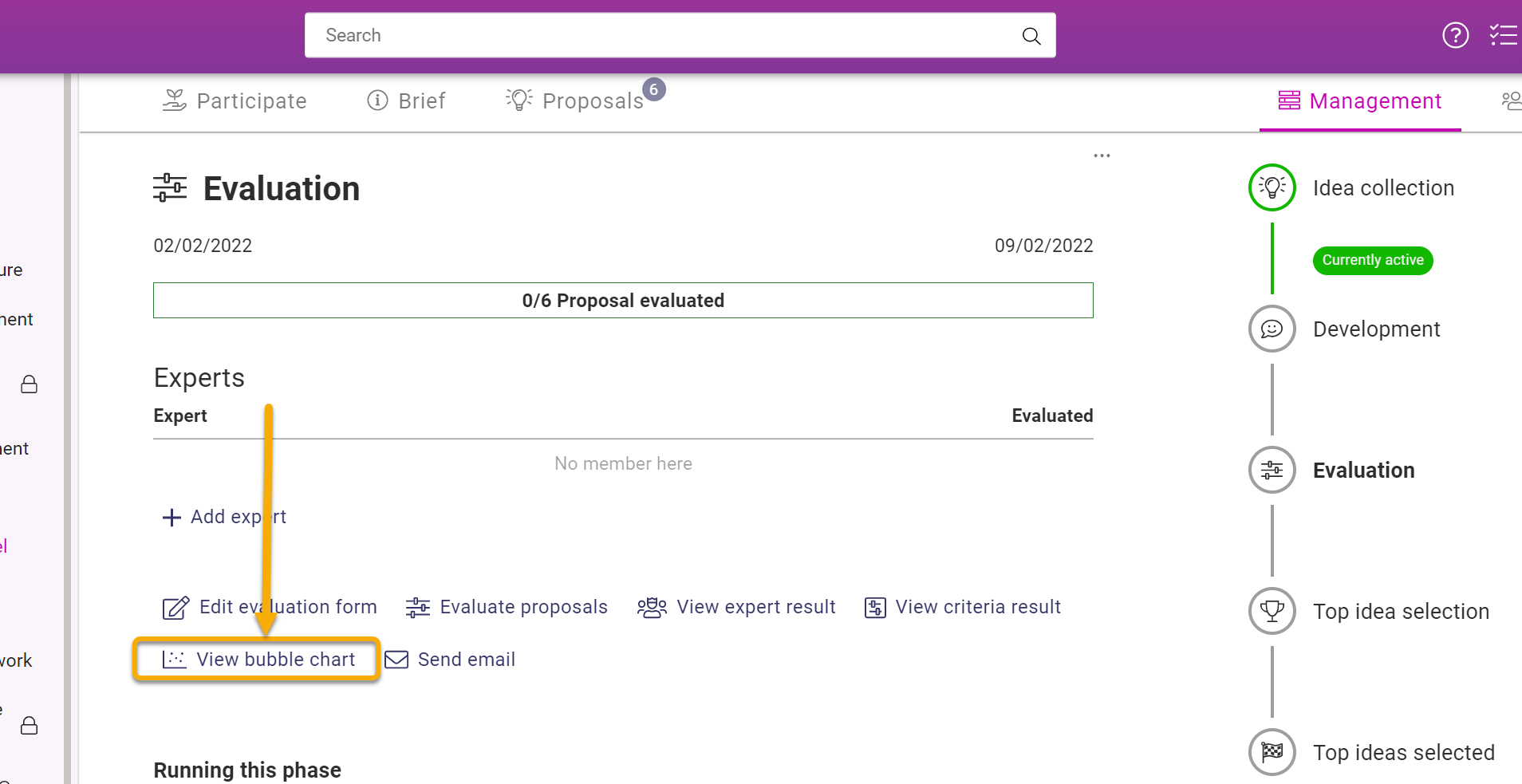
Challenge-> Management-> Evaluation-> View bubble chart
2. By adjusting the values of the X and Y axes, you can set the values of the proposals on the graph.
- The values on the graph are the numerical estimates given on the proposal form and are positioned on the graph according to the selected values.
- The values are selected from the ends of the X and Y axes.
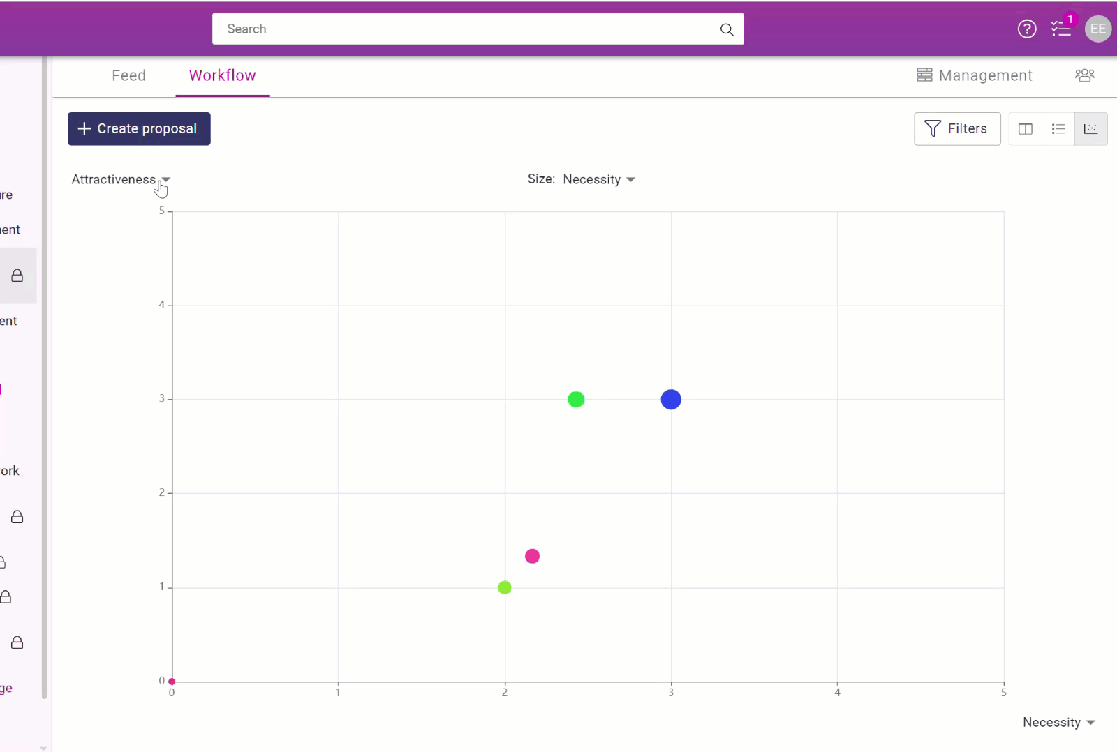
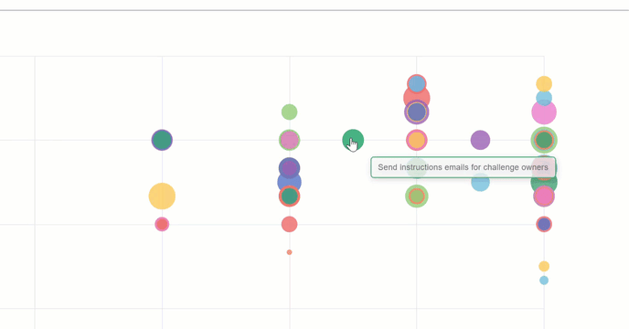
- A model of a bubble chart with lots of suggestions. Multi-colored bubbles have several proposals of an equal value.
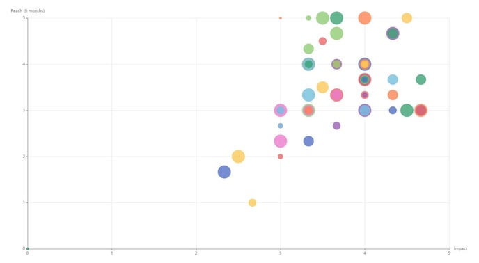
3. Viewing proposals on a bubble chart
- You can see the name of the proposal by hovering your cursor over the bubble.
- Click on the bubble to read the proposal and its comments, evaluations, and decisions.
- Close the proposal and return to the bubble chart by clicking on the cross in the top right-hand corner.
💡The bubble chart is particularly useful during the evaluation phase, as you can see all the proposals at once.