Review numerical evaluations with a bubble chart
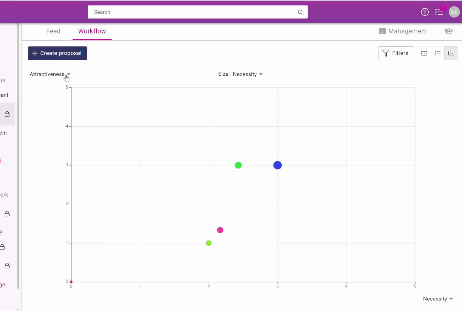
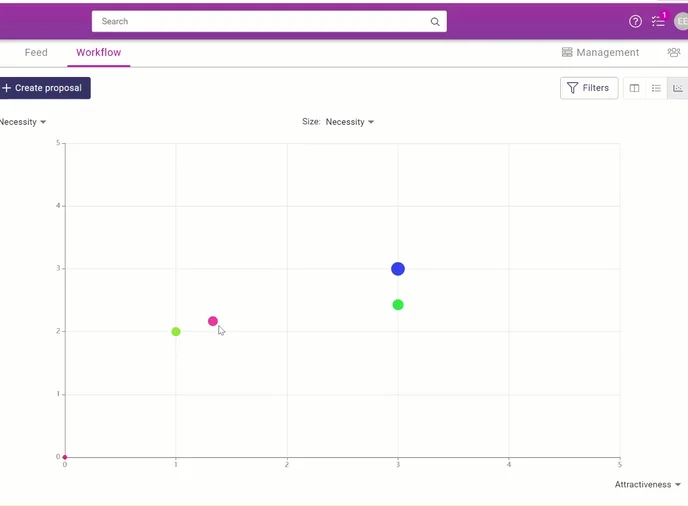
The bubble chart presents the proposals using the X and Y axes
Locations of bubble charts
You can visually view the evaluation of proposals by selecting the bubble chart:
Channel- > Workflow-> Chart icon above the status lanes in kanban
Bubble chart in a challenge:
Challenge- > Proposals-> Chart icon above card / list view
By adjusting the values of the X and Y axes, you can set the values of the proposals on the graph.
The values on the graph are the numerical estimates given on the proposal form and are positioned on the graph according to the selected values.
The values are selected from the ends of the X and Y axes.
A model of a bubble chart with lots of suggestions. Multi-colored bubbles have several proposals of an equal value.
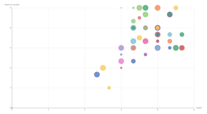
Viewing proposals on a bubble chart
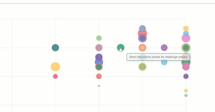
You can see the name of the proposal by hovering your cursor over the bubble.
Click on the bubble to read the proposal and its comments, evaluations, and decisions.
Close the proposal and return to the bubble chart by clicking on the cross in the top right-hand corner.
INFO
💡 The bubble chart is particularly useful during the evaluation phase, as you can see all the proposals at once.